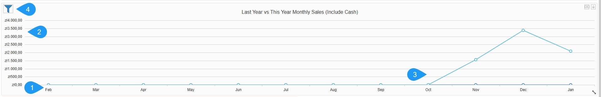
- Timeframe (X-Axis): Shows a breakdown by month (e.g., Feb, Mar, Apr, etc.).
- Revenue Scale (Y-Axis): Shows the total value of sales in the local currency (e.g., zł - Polish złoty).
- Comparative Data: Visualizes how current monthly performance stacks up against the same period in the previous year.
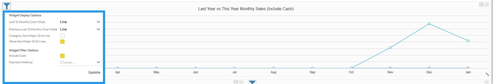
Filters
Filters
- Last 12 Months Chart Style: Choose the data visualization format for the current period: line, column, or area.
- Previous Last 12 Months Chart Style: Choose the data visualization format for the comparison period: line, column, or area.
- Category Axis Major Grid Line: A toggle to show or hide vertical background grid lines.
- Value Axis Major Grid Lines: A toggle to show or hide horizontal background grid lines for better value readability.
- Include Cash: A checkbox to add or remove physical cash transactions from the totals.
- Payment Method: A dropdown to filter the data by a specific provider or type, such as Credit Card, Prepaid Credit, or others.